As more and more of our lives integrate with web technology, the need for digital accessibility grows, so in honor of Global Accessibility Awareness Day, the IT team has put together this brief overview. Accessibility from a web design and content perspective means taking into account the needs of users who have low or no vision, users with cognitive disabilities, as well as users with physical disabilities. And that's no small number of users either; an estimated 20 percent of Americans are living with a disability. The goal of web accessibility is to create a more inclusive digital space, so that all information is available to, and easily accessible for, all users.
And frankly, accessible design leads to better content all around. Much in the same way ADA-compliant ramps and automatic doors have made life easier for all of us, accessible design will do the same thing for the web. Accessibility is necessary for some, but it will benefit us all.
So who's leading the charge?
Well, you are. You and all other digital content creators. Accessibility is a big topic and a little guidance never hurts. When planning content we should look to the Web Content Accessibility Guidelines (WCAG), which were assembled by the World Wide Web Consortium (W3C), an international community of industry professionals who work with the public to develop Web standards and guidelines.
WCAG is based on four principles. Content should be: perceivable (content should be available to all users either through a browser or through assistive technologies, like screen readers), operable (the user can interact with content using either a mouse, keyboard, or an assistive device), understandable (content should be clear), and robust (content should be accessible by a wide range of technologies).
At the moment, WCAG 2.0 is the accepted standard; it is used by the federal government to inform its requirements in Section 508 of the Rehabilitation Act of 1973. However, a newer set of recommendations, WCAG 2.1, was released in June 2018. WCAG 2.1 is backwards-compliant, so it covers everything in WCAG 2.0, but these newer guidelines are more robust and do a better job of addressing advances in mobile technology.
As many of you know, becoming Section 508-compliant is required of all government websites, but everyone should be paying attention. Private companies and organizations have increasingly found that accessibility isn't just for the feds. Lawsuits over compliance nearly tripled in 2018; not even Beyoncé is immune.
Remember this has a real world impact
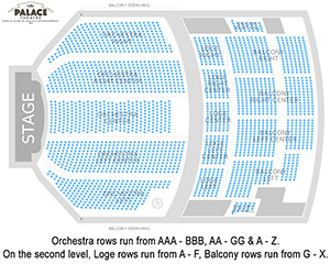
You don’t need to search far to appreciate the necessity of including accessibility in design. For example, the image below of a theater's seating chart highlights the value of sharper contrast ratios and the importance of thoughtful text placement. In its current iteration, this map is nearly unreadable, both for users with and without visual challenges, such as low vision and colorblindness.
There are many web tools available, such as simulators and accessibility evaluators, that can streamline the mindful design process. The Chrome extension Funkify simulates the experience of surfing the web with a range of cognitive, visual, and motor challenges. The pelican image below has been funkified using the protanopia filter, simulating the experience of seeing the world without any working red cone cells.
 Poor color contrast makes the seating chart for the
Palace Theater in Albany, NY almost unusable.
 This image has been funkified: the protanopia filter
is in use. Click through to see the original image.
How to be part of the solution
Without digging into all the nitty-gritty details of WCAG, here are some easy ways to keep accessibility in mind when creating content.
Color & Contrast
Color contrast is one of the simplest ways to incorporate accessibility in your design. This isn't web-specific either. Keep it in mind when designing anything from fliers and briefs to Power Point presentations. The sharper the contrast ratio, the more readable your content becomes. This is particularly important for people with colorblindness and low vision.
It's also important to be sure that you aren't relying on color alone to convey significance. In web design, this means making sure that linked text is both underlined and a different color from unlinked text. On a poster, it might mean ensuring that virtually identical images don't rely solely on color for differentiation.
Descriptive Links
Many screen readers have the ability to skip from link to link without touching the content in between. This means it's crucial that linked text is descriptive enough that it can stand on its own without needing the context of surrounding words to inform it.
Clarity in Content
Readability is one of the easiest ways to implement accessibility in content. There's nothing wrong with writing for your target audience. However, it's important that the message be accessible to more than just our members. Examples of good practices include staying away from industry jargon or unexplained acronyms, writing short, clear sentences, and using the active voice. Read through this article of tips for writing clearly and simply for more detailed guidance.
Use the "Check Accessibility" Function
There is a built-in accessibility checker in the Microsoft Office suite and most Adobe products. You can even set the checker to continually run as you create documents in Office for real-time suggestions to increase accessibility.
What Comes Next?
For ASTHO, the need for accessibility and inclusion is inherently baked into our organizational DNA—our vision statement calls on us to help state and territorial agencies advance health equity for all. The best way to do that is to ensure our message is accessible to all users.
#ITTip
#TechTip